AURA
Team Lead
|
Apr - Jun 2025
| Goal : Turn exhibition visits into meaningful, lasting experiences
| Team : 4 designers
| Duration : 2 months
| Role : End-to-end design, user research, UX/UI, design system, branding, usability testing
| Tool : Figma, Notion, Maze
| Links : Foundations, Components, Prototype
This app explores how Gen Z experiences, interprets, and connects with exhibitions as part of their daily lives. Our objective was to support intuitive discovery, reflection, and personal archiving of exhibitions.
I led the end-to-end design of this concept product, guiding a team of four designers over two months. We conducted in-depth user research and developed the information architecture and user flows to shape a seamless user experience. I also worked closely with one other designer to build a scalable design system and create core branding assets such as the logo, color palette, and typography that established a cohesive visual identity for launch.
Mission
The core mission of this MVP was to reduce friction in cultural discovery, driving repeated user interaction and stronger emotional connection with art. Despite high interest in cultural activities, many exhibitions are passively consumed and easily forgotten. We aimed to design a mobile service that not only helps users intuitively curate their favorite exhibitions, but also encourages reflection and personal archiving, allowing their experiences to grow, deepen, and stay with them over time.
We were informed by in-depth user interviews and behavioral research, the app integrates visually rich exploration, effortless bookmarking, and personal archiving, making each visit more intentional and memorable.
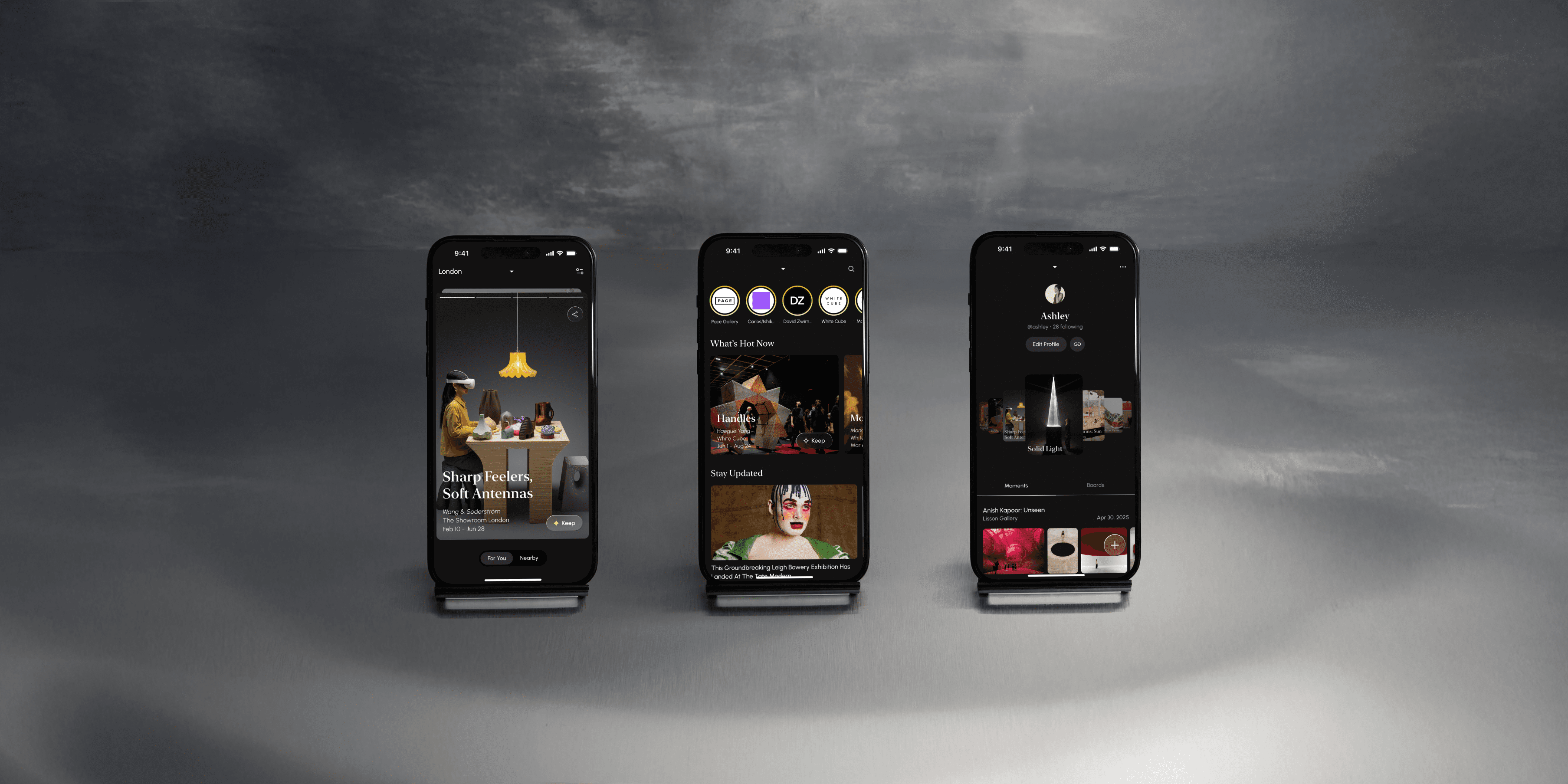
AURA is a mobile experience that lets Gen Z users intuitively explore, save, and reflect on exhibitions — bridging casual interest and long-term engagement.
Usability testing revealed a strong emotional resonance and an NPS of 8.7, affirming the product’s intuitive navigation and relevance to everyday culture engagement.
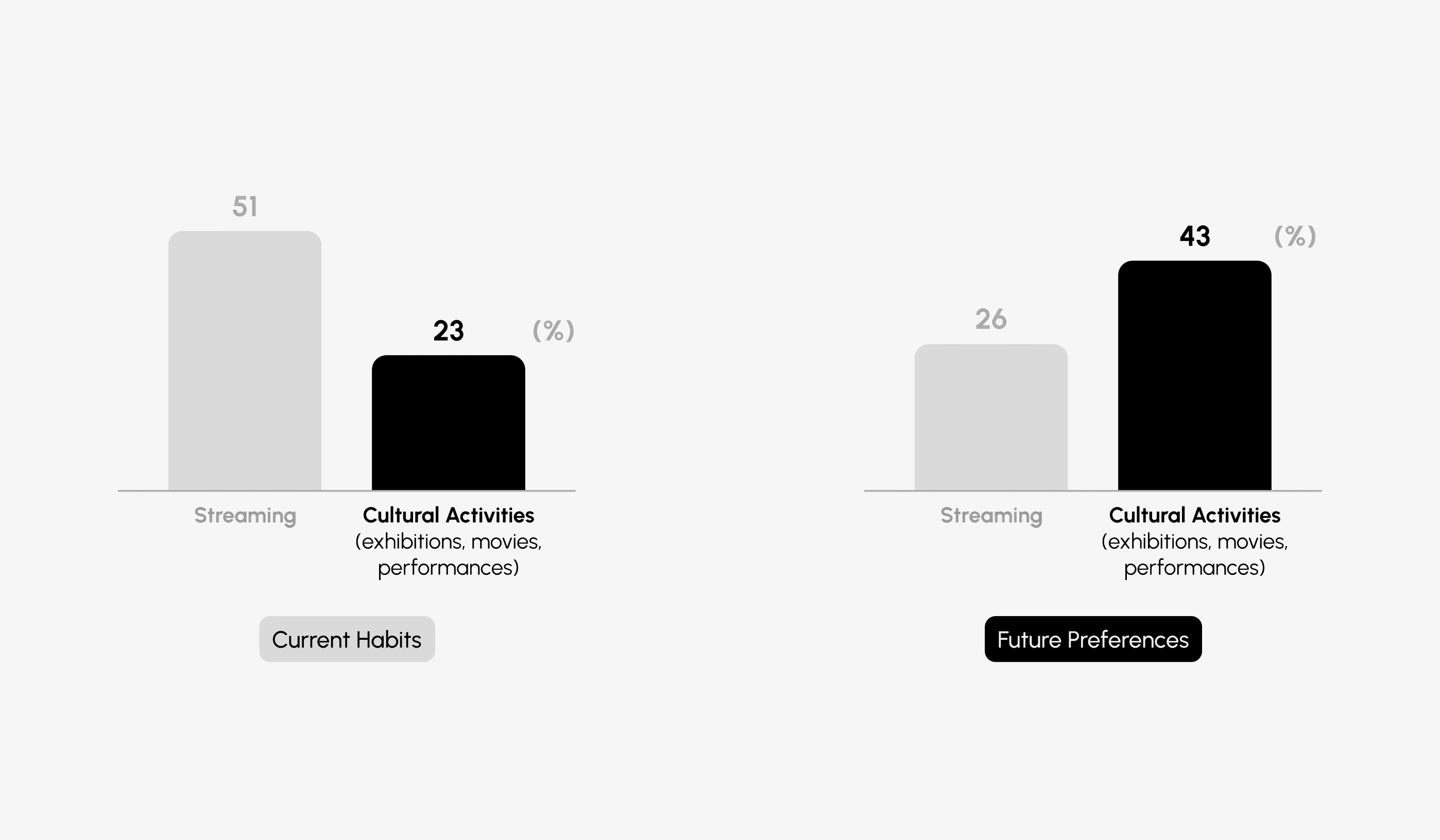
source: Shinhan Card Big Data Research Center
While streaming still dominates daily media consumption, exhibitions are quickly rising as a preferred offline activity among Gen Z. No longer seen as niche, exhibitions have become a go-to activity, whether for dates, outings, or simply inspiration.
As brands tap into this trend with pop-ups and art-led marketing, exhibitions are becoming both everyday leisure and a new cultural touchpoint.
How do people discover and further engage with exhibitions?
To better understand user needs and behaviors, we conducted a survey to understand the overall flow of exhibition experiences.
Our findings revealed a clear gap:
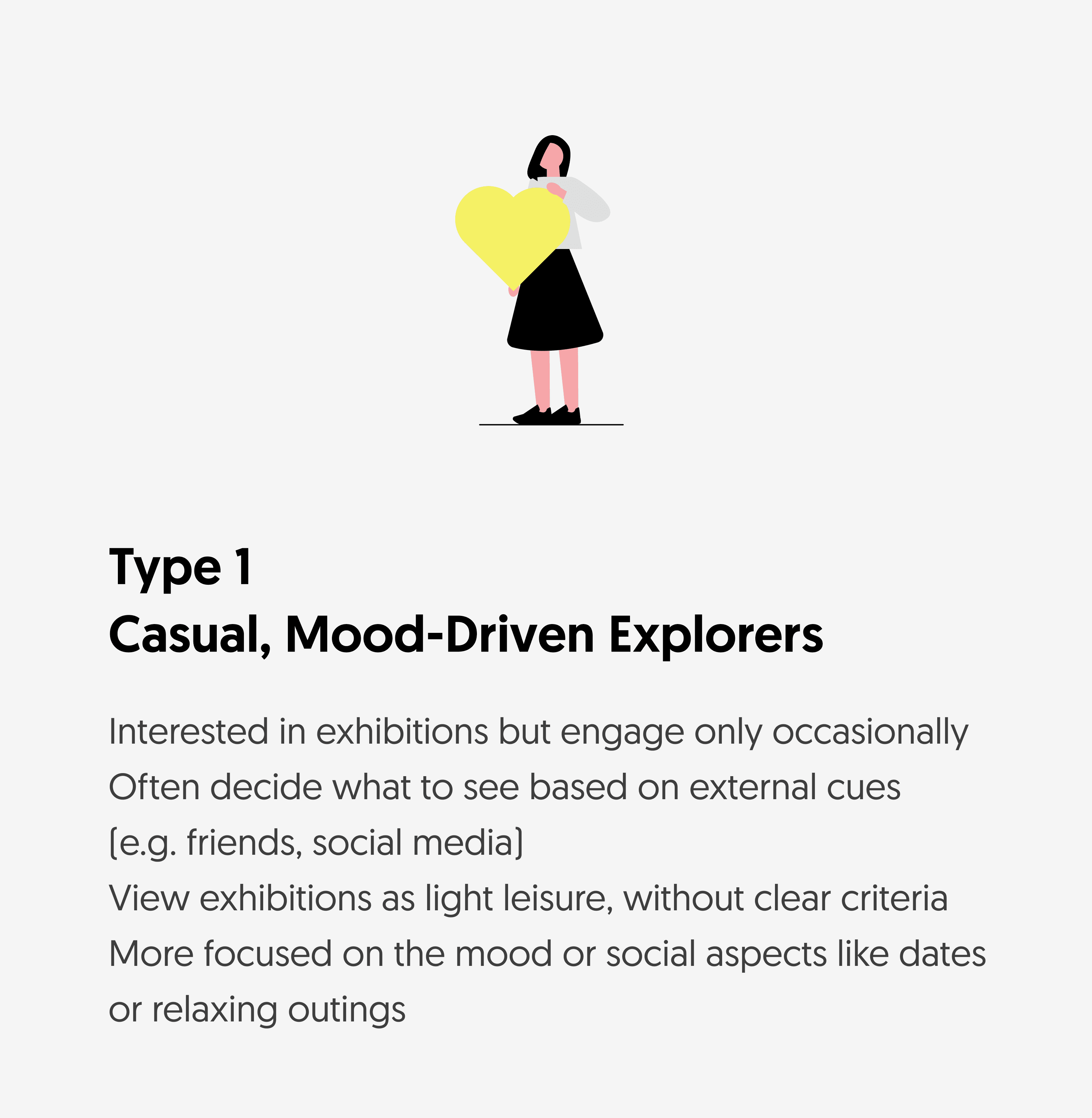
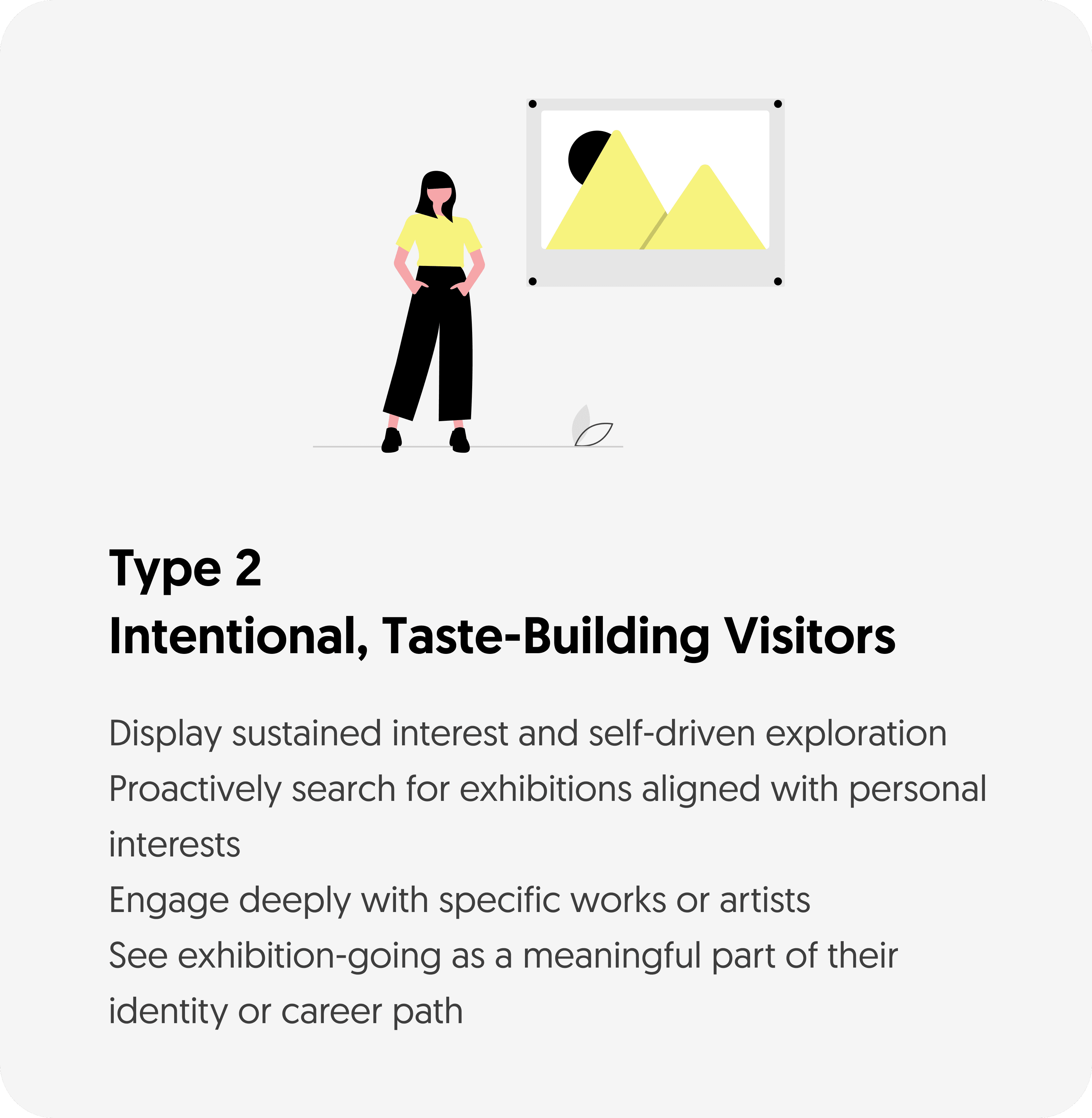
While most respondents were curious and eager to explore exhibitions, they often stumbled upon them by chance, explored passively through Instagram, and rarely documented or reflected on the experience.
Exhibition-going was often a one-off, short-lived interaction rather than a meaningful cultural habit.
To dive deeper, we conducted in-depth interviews with participants from both groups and mapped out their end-to-end exhibition journeys, including how they discover, plan, and reflect on exhibitions post-visit.
We broke down the current journey into four stages and identified key friction points.
How might we welcome casual visitors into more intentional, self-guided exhibition experiences, while offering both user types space to grow, reflect and shape their visual identity?
Based on user insights and pain points, we formulated the following hypothesis to inform our design direction.
If users are presented with visually engaging and intuitive exhibition content, they are more likely to explore and engage with new exhibitions, even without prior interest or background knowledge.
If users can easily record and visually reflect on their exhibition experiences, they will develop a clearer understanding of their personal taste, leading to repeated exploration and deeper interest in related content.
To validate these hypotheses and understand the current landscape, we analyzed existing exhibition-related apps and services.
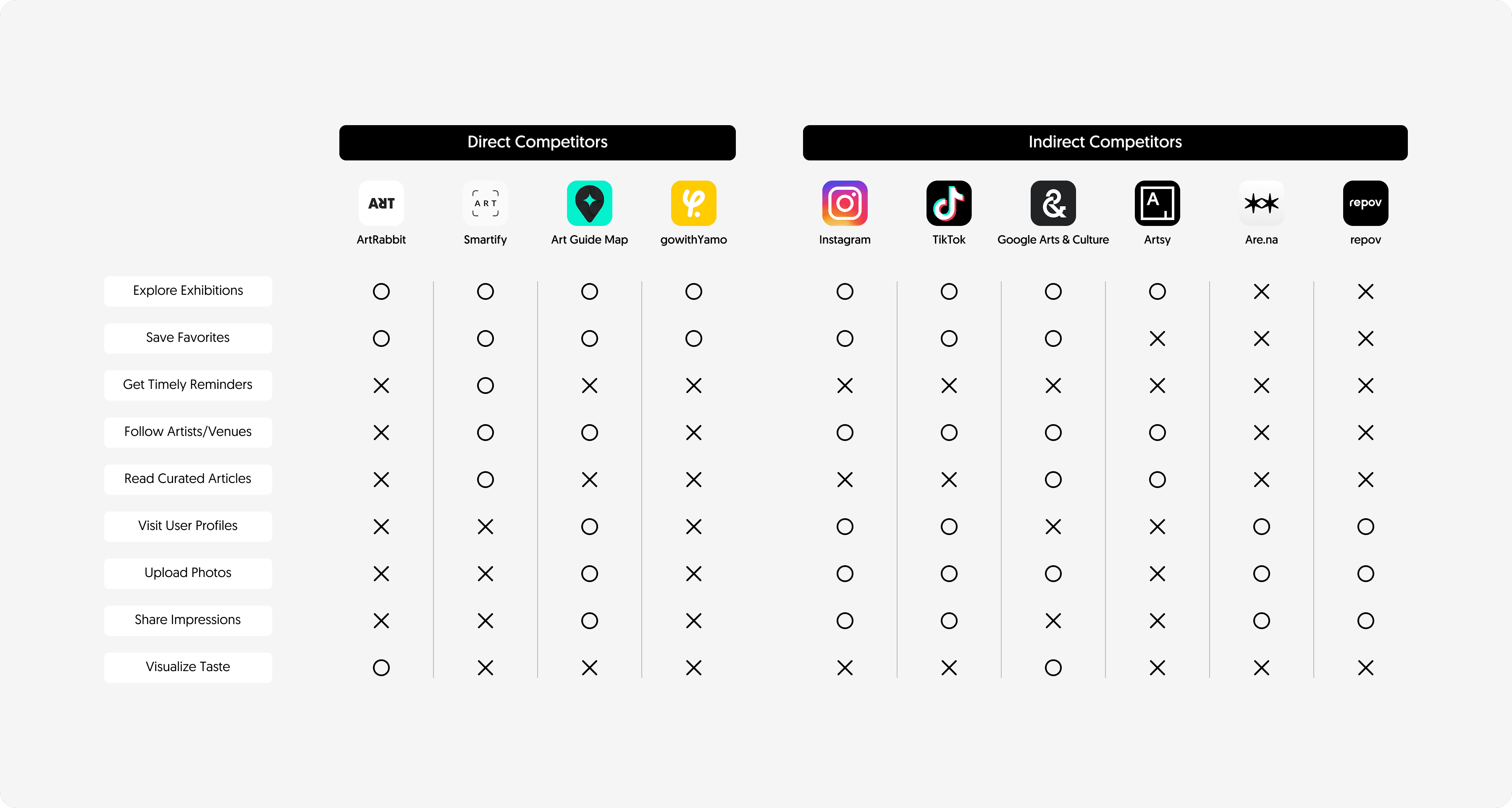
Competitor apps were evaluated based on how well they support each stage of the exhibition-viewing journey, from sparking initial interest to helping users reflect after their visit. Rather than listing features, we mapped them onto this user-centered flow to uncover coverage gaps and imbalances.
Ultimately, no existing service connected the full journey in a cohesive and meaningful way. Most focused on just one or two stages, with limited support across the complete experience.
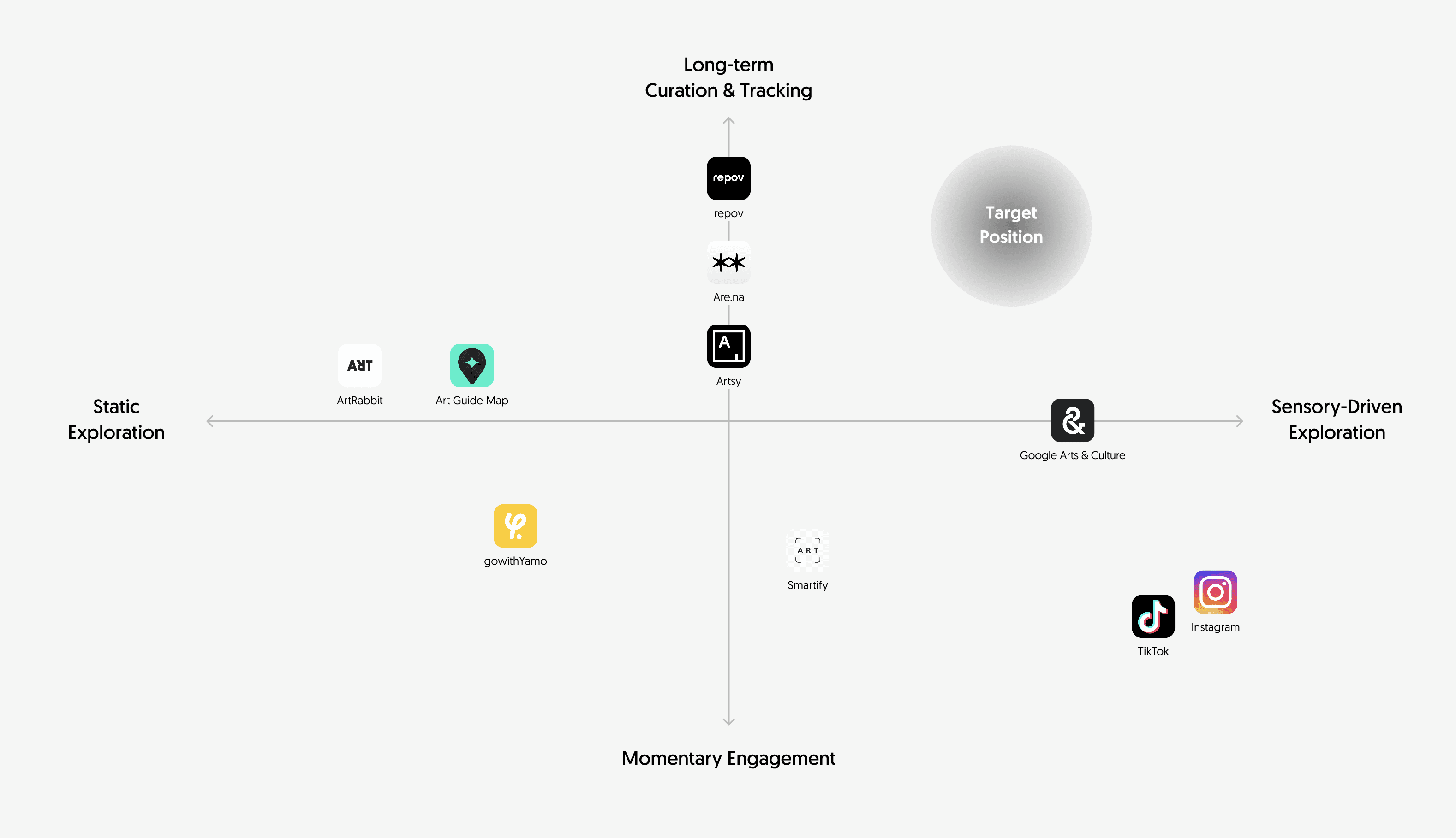
In addition to feature-based comparison, we examined how each app shapes the user's exploration behavior and overall consumption flow. We uncovered patterns in how different platforms serve various user needs and touchpoints by mapping apps across two key axes: exploration style (static vs. sensory-driven) and engagement depth (momentary vs. long-term).
This helped identify a whitespace opportunity: no app meaningfully supports sensory-driven exploration combined with long-term reflection and taste-building. This gap clarified our positioning and informed the direction of our design strategy.
Underlying this journey are three core values of what draws them in to how they reflect and express their evolving aesthetic.
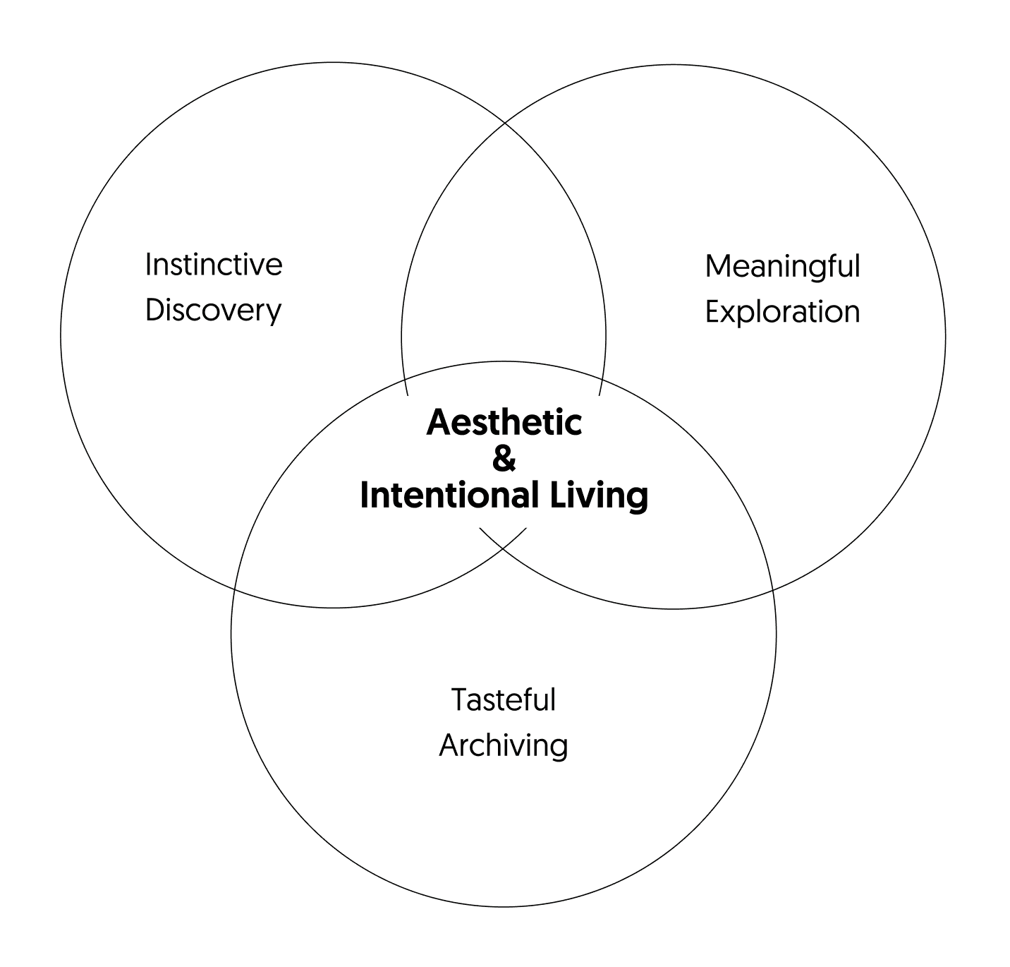
Instinctive Discovery
Start with what catches your eye
Meaningful Exploration
Go beyond the obvious through stories, spaces, and shared tastes
Tasteful Archiving
See your preferences take shape over time
Aesthetic & Intentional Living
Let exhibitions shape a more thoughtful, expressive life
By enabling intuitive discovery, deeper exploration, and post-visit reflection, the platform encourages users to engage more meaningfully with exhibitions and gradually shape their visual identity.
To translate our vision into tangible design decisions, we defined three core MVP features aligned with the user's exhibition journey:
Sensory Discovery – A visually rich feed that allows users to browse exhibitions intuitively and enjoyably through images and videos.
Seamless Exploration – A frictionless yet layered browsing experience that allows users to dive deep through curated content, artist and gallery profiles, real-time updates, and personalized discovery paths.
Visual Reflection – A space where users’ viewing history and preferences naturally accumulate and shape their evolving taste, feeding back into future discovery.
Building on these pillars, we prioritized possible features using the MoSCoW method. Each function was assessed based on how well it supports the intended user journey, ensuring our design choices align with users’ needs and behaviors.
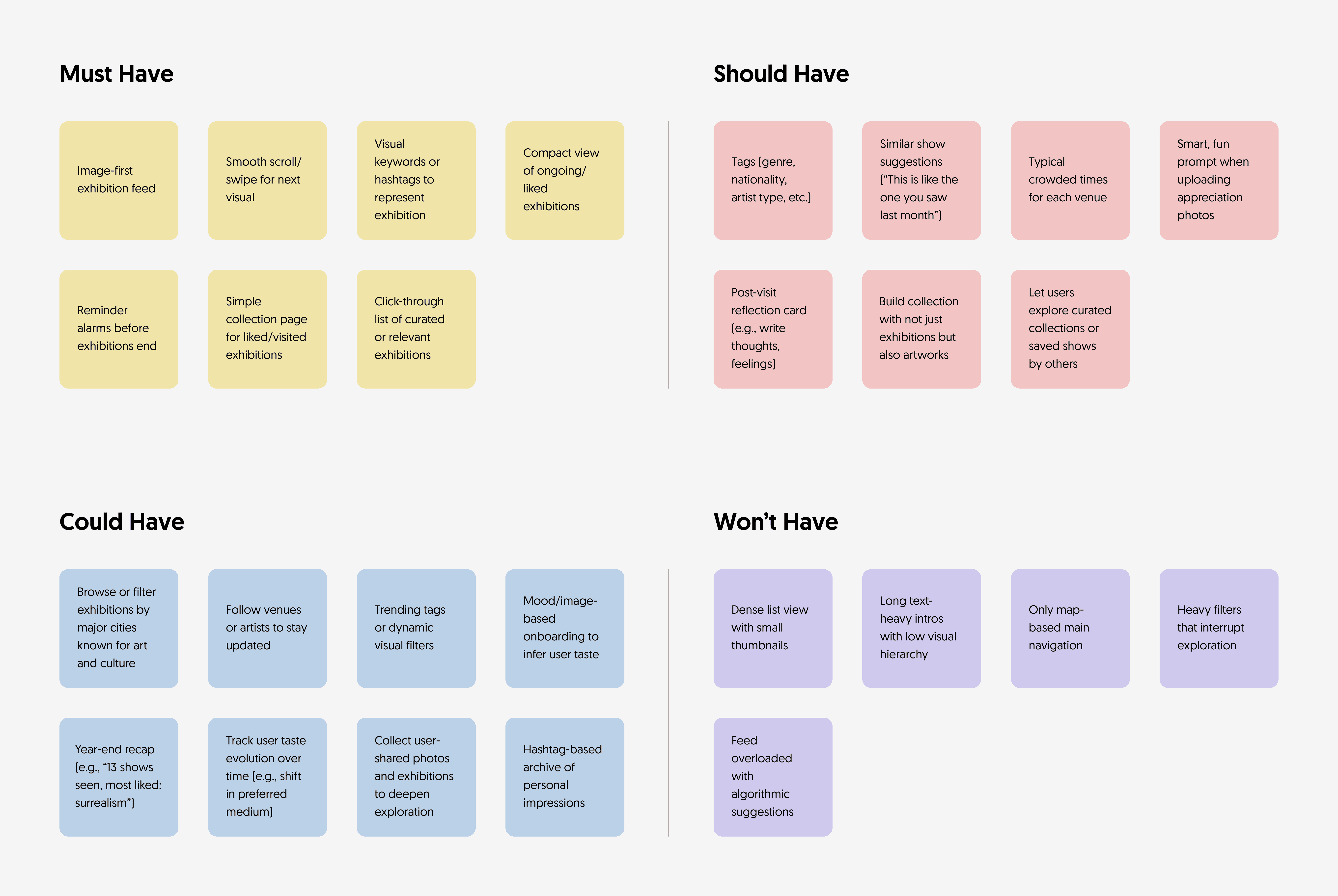
Must-Haves were chosen to ensure that discovery feels lightweight, visual, and continuous, from swipe-based exploration to reminders and simple collection views. These basics support a smooth and intuitive flow, especially for casual visitors who may be browsing without a set goal.
Should-Haves extend emotional and personal connection, such as reflection prompts or artist-based suggestions, helping users form deeper memories and start identifying their own taste, even if they don’t do so intentionally at first.
Could-Haves point to potential areas of growth, like helping users track how their preferences evolve over time, or dive deeper into community-curated content. These features weren’t prioritized for the MVP, but align with the platform’s longer-term value of taste-building.
Won’t-Haves reflect a conscious effort to avoid overwhelming or rigid structures, such as feed-first navigation driven purely by algorithms, dense list views, or relying solely on map-based interactions. Map is included as a supportive view (e.g., to check location or saved shows), but not used as the primary entry point.
The feature prioritization reflects a clear intention, without overwhelming users with complexity or clutter. This framework helped us stay focused on designing a product that not only informs, but inspires: turning casual visitors into engaged, reflective exhibition-goers.
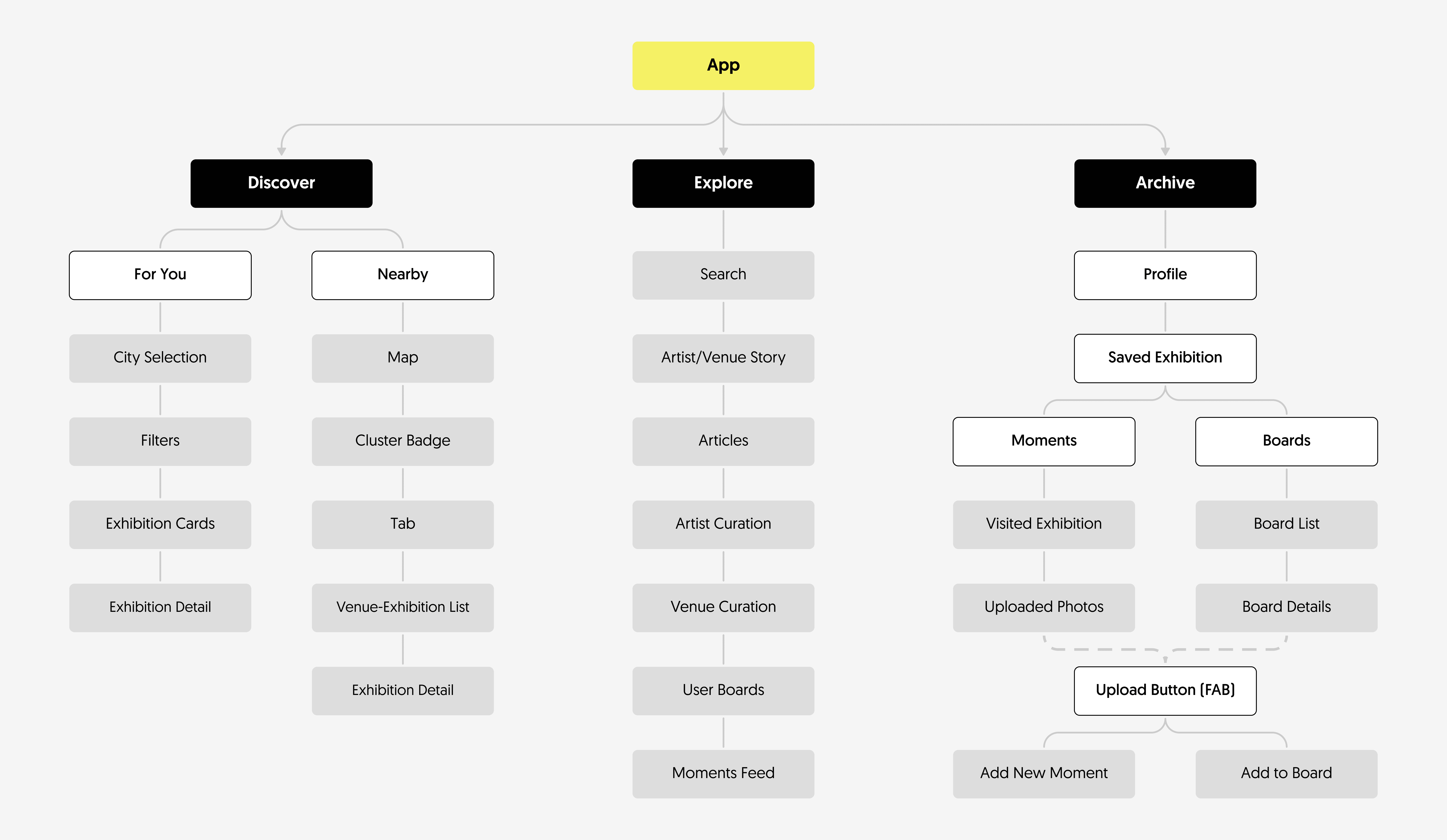
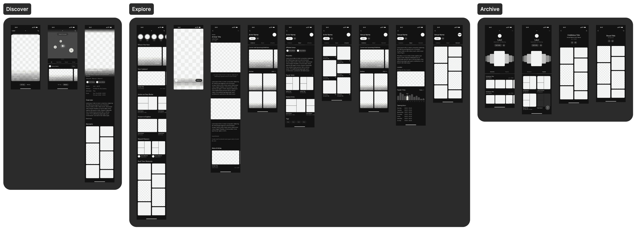
We built wireframes based on the IA, which were later refined into a high-fidelity prototype with interactive elements and a polished user experience.